|
A Town in Staffordshire |
|
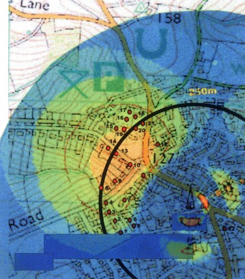
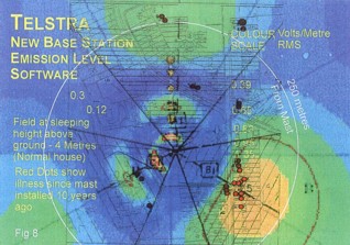
Note that radiation strengths are shown at 4 metres above ground level |
|
(Normal sleeping height) |
|
See also the street map for the same area, below this chart. |
|
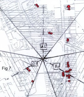
Showing Sectors Covered |
|
Dotted Lines Indicate |
|
Dr Walker has told me that
he is now working on a chart for a mast in London that has antennae
covering four segments - that is, at 90 degrees to each other. |
|
It’s notable that the
lines of cancer cases also run out at 90 degrees to each other - |
|
in direct alignment with
the centre-lines of the beams from the antennae. |
|
As John himself observes,
if the operators were to provide accurate coverage plots for their
various masts and these were to be correlated with ill-health
clusters around each of those masts, who knows what might be
learned? |
|
It’s not beyond the wit
or powers of the Government to require such information, nor would
it cost very much to do so. The very real data, about very real
people and the very real effects on their lives, that could be
gleaned from such an exercise would give the NRPB - referred to by a
friend of mine as ’The No Ruddy Protection Board’ - plenty to think
about. Maybe that’s exactly what they don’t want. |
|
STOP PRESS |
|
See also
this story from 4th July 2004, in
which the NRPB is accused of “misusing” science. |
|
Quote:
“It is sad that the NRPB, which should be an independent body, was
complicit .” |
|
Dr Keith Baverstock, who
was the World Health Organisation’s senior radiation adviser in
Europe, says that science has been “perverted for political ends” by
government agencies which should be protecting public health. |
|
“Politics, aided and
abetted by some in the scientific community, has poisoned the well
which sustains democratic decision-making,” he told a conference on
low-level radiation in Edinburgh yesterday. |
|
|
|
|
|
|
|
Evidence That Even the NRPB
Can’t Ignore |
|
(Put these pictures on your office wall, Dr Clark, |
|
and think about them every time you assure people that |
|
“There is no evidence of health risks from masts”) |
|
[Be sure not to miss the ‘Stop Press’ at the end] |
|
|
|
We hear a lot of nonsense from the
establishment about cancer clusters around masts being ‘ just
coincidence’. Statistics ‘experts’ are rolled out from time to time to
‘prove’ that the likelihood of a cluster of ill-health around a mast is
no less (if rather more distressing) than the likelihood of dealing a
number of red cards in a row from a newly-shuffled deck. They seem
strangely willing to ignore the ‘repeatability’ element of this
particular experiment with people’s lives (strange in that
’repeatability’ is something they claim to be very keen on). |
|
Not just one mast, but numbers
of them all around the country, are playing host to a variety of
ailments that destroy people’s lives, destroy families, in some cases
destroy communities. Cancer (various types), Thyroid disorders, Motor
Neurone Disease, Parkinsons Disease, etc, etc. The statistical
probability of such a ’repeatable experiment’ being pure chance reduces
with every such cluster that occurs. |
|
In simple terms, if the odds of
one such cluster are one in a thousand then the odds of two are that
squared - one in a million. The odds of three are the cube - one in a
billion - and so it goes on. In fact, the likelihood of just
one cluster of the sort
we’re seeing now is very much lower, since they include abnormal numbers
of very rare
conditions like Motor Neurone Disease (could this be why I hear frantic
clickings on my phone line when Motor Neurone Disease is referred to -
Mr Tapper down the line has his orders from people who know that MND is
a serious real threat to our health and to their plans). |
|
No matter. Dr John Walker of
Sutton Coldfield has been conducting some very informative practical
research into the distribution of ill-health in clusters around masts.
Dr Walker spent over 40 years in statistical research for Dunlop,
identifying causative factors, pinning down the extent to which certain
effects were due to various causes. ‘Causative factors’ are what the
mast health issue is all about - to what extent are masts responsible
for health effects around them? In this respect Dr Walker’s back-ground
makes him an ideal person to undertake this study. |
|
In association with Eileen
O’Connor of The Radiation Research Trust, using data collected by a Mast
Sanity worker from ill-health clusters around masts, John has produced
maps of some of those clusters. He has superimposed on those maps
approximate plots of the field intensity from the mast in question in
each case. These are based on observations as to the type of antenna,
its height and direction. |
|
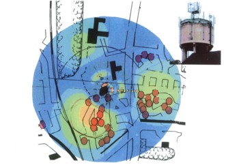
The exact coverage plots as produced by the operators are not available, so these approximate plots have had to be used. It’s likely that those actual coverage charts would give a much more accurate picture of the degree of correlation of health effects with beam intensity. Having said that, the evidence here is fairly conclusive. Note how the dots, representing ill-health cases (ill people) lie in, and in a few cases very close to, the maximum intensity areas (coloured orange, then lime-green), thinning out in the areas of slightly lesser intensity (paler green), and are almost totally absent from the least intense areas (pale blue then darker blue). |